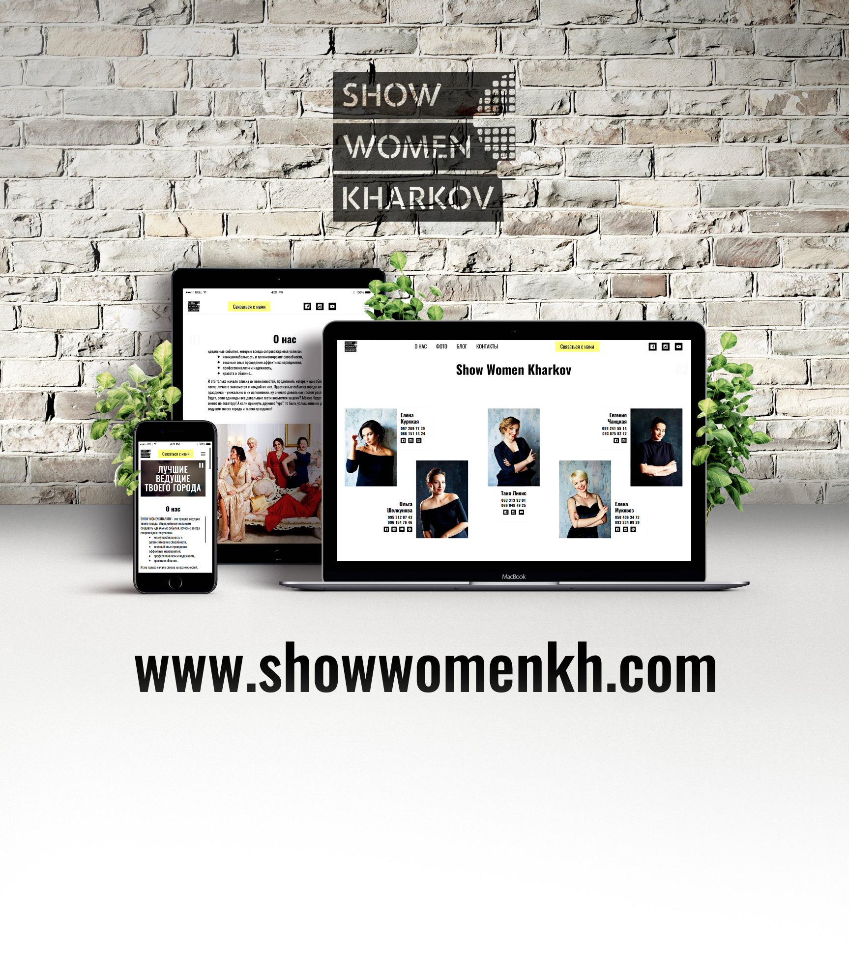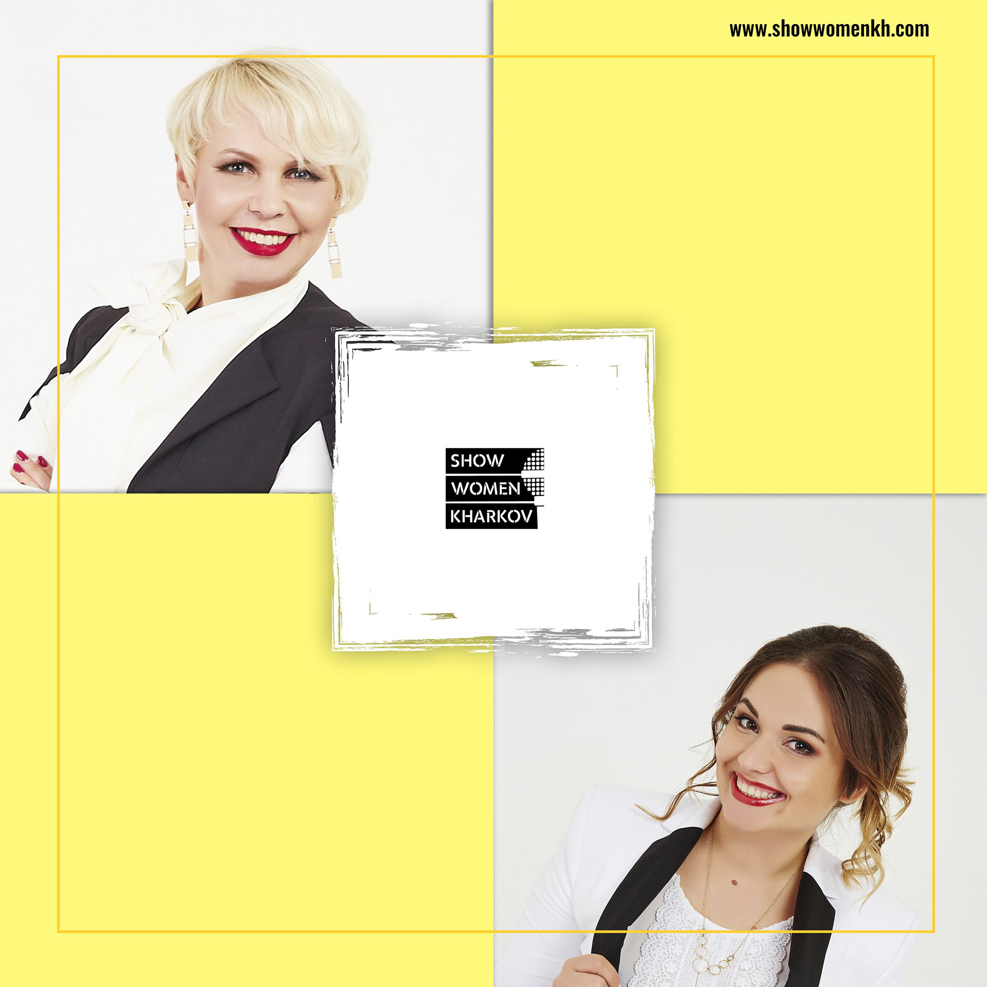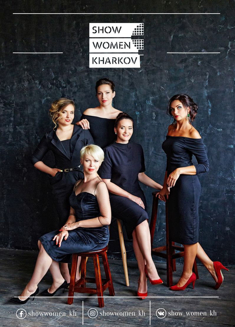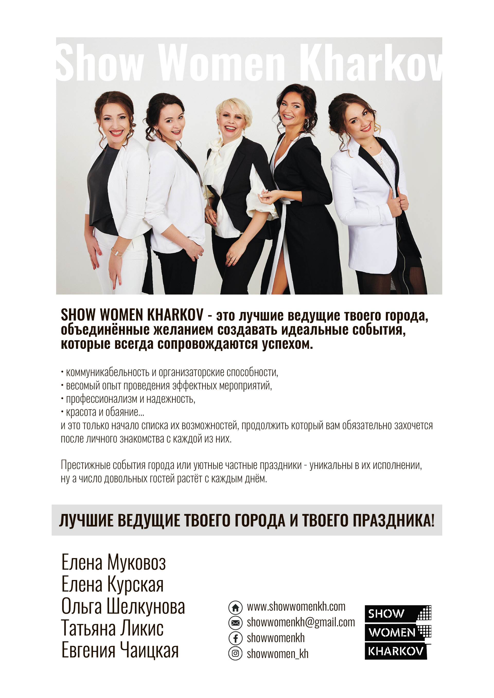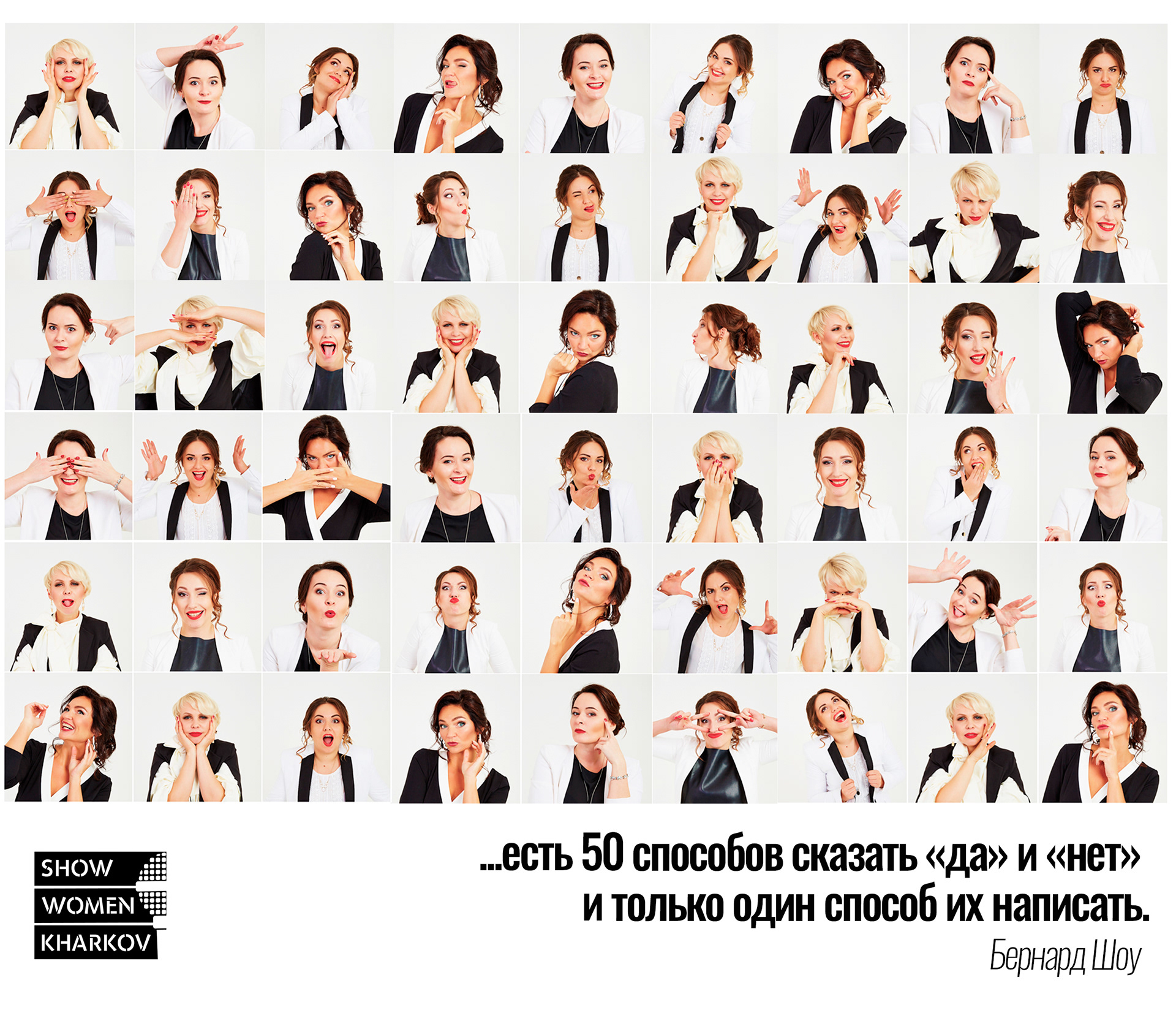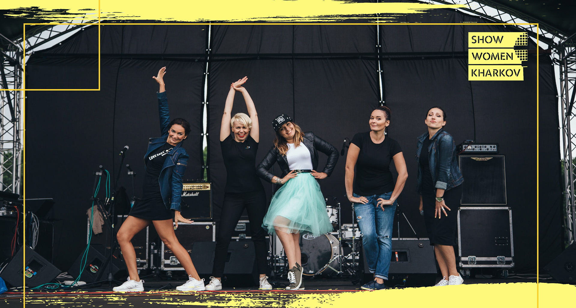

This is an association of Kharkov MC girls who make events.
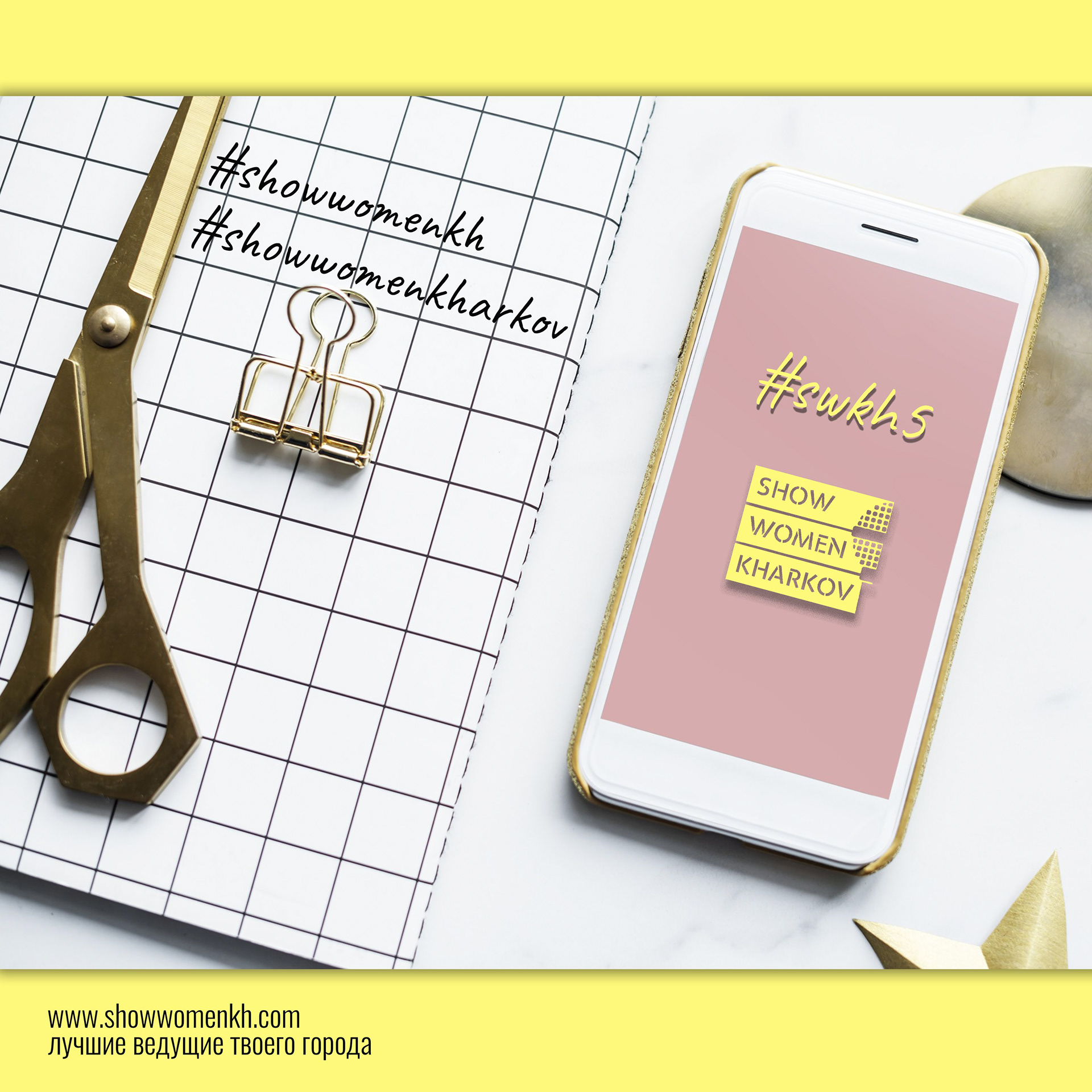
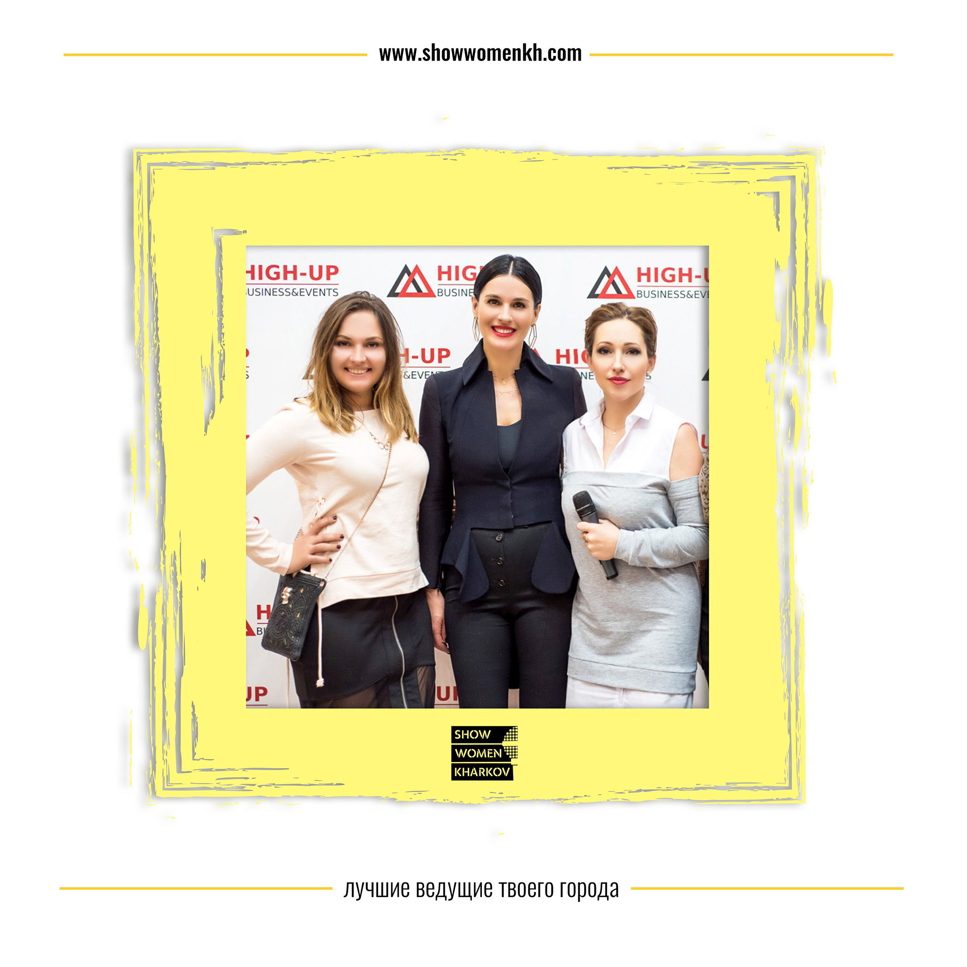
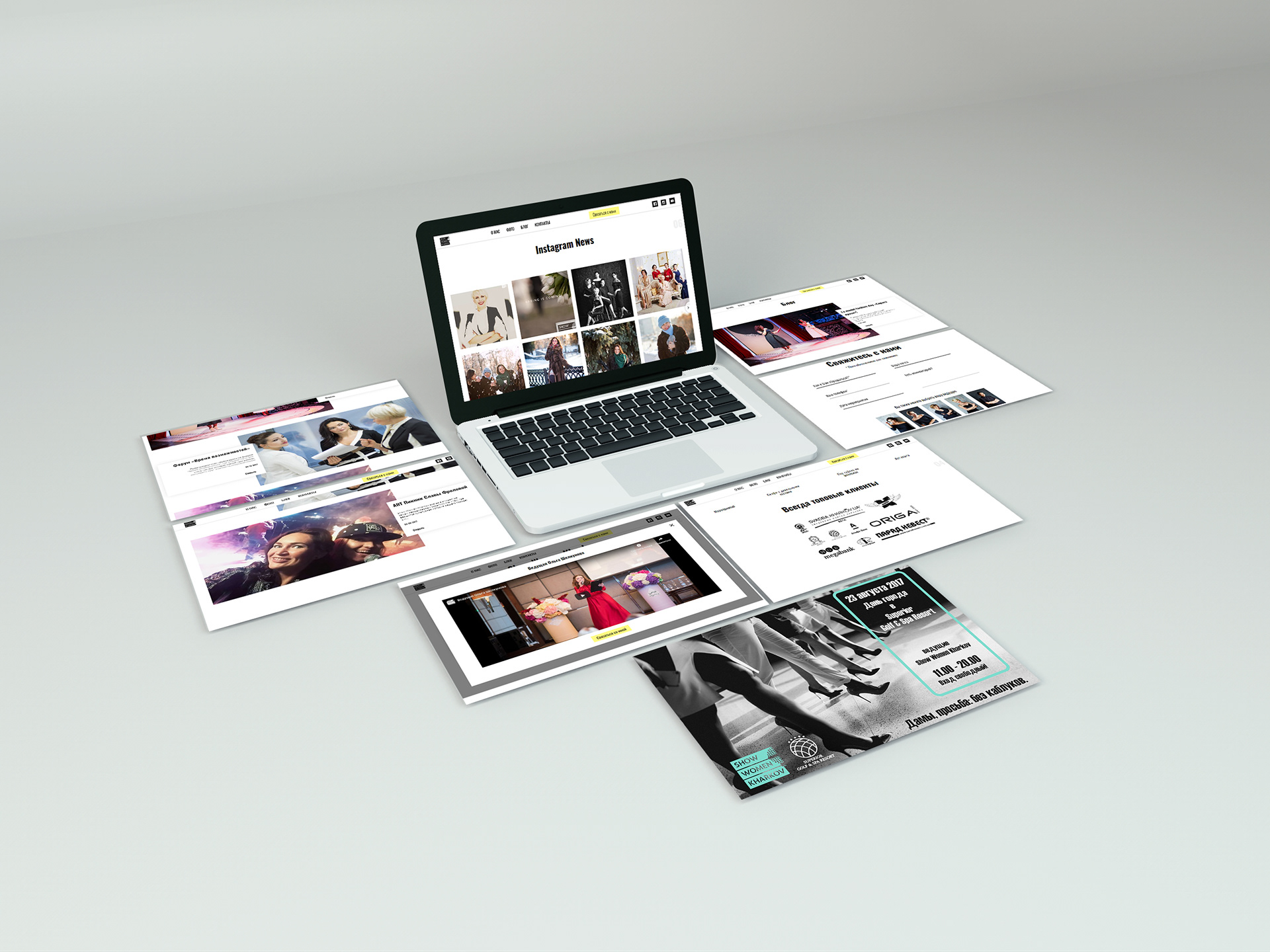
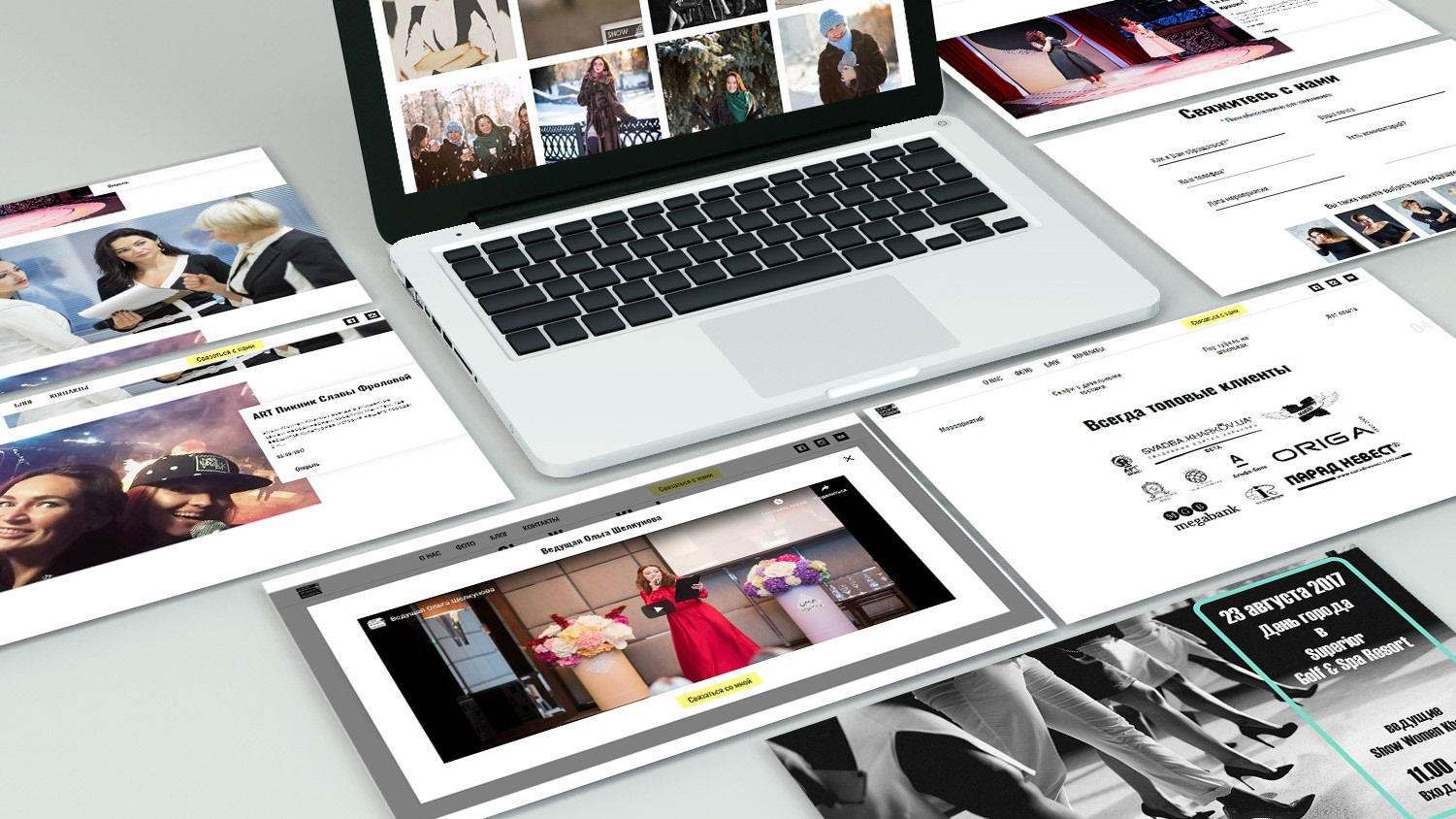
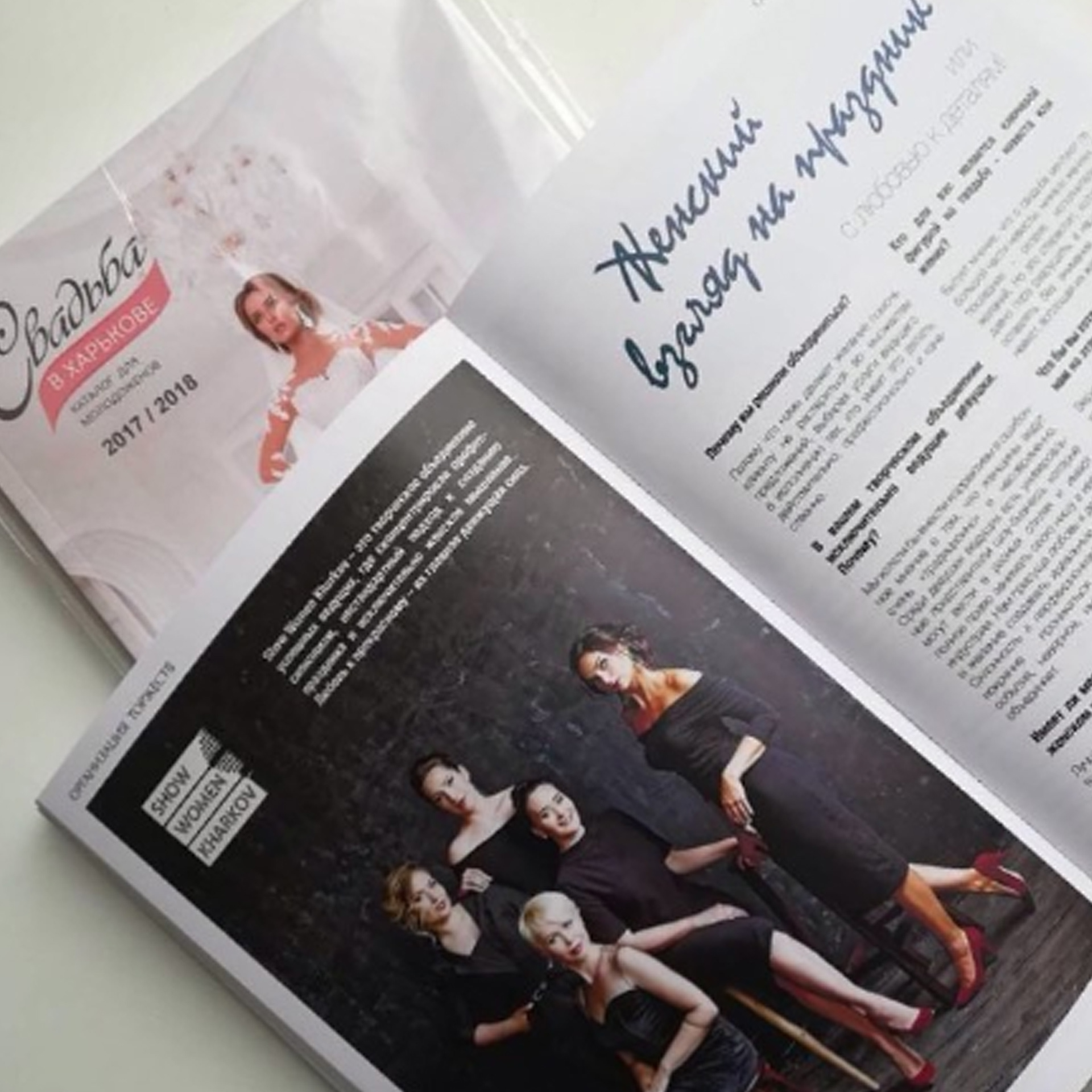
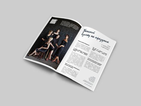
My task was to develop a corporate identity, logo, templates for social networks, video clips, part of the design for the website, as well as promotional products including articles in magazines, etc.
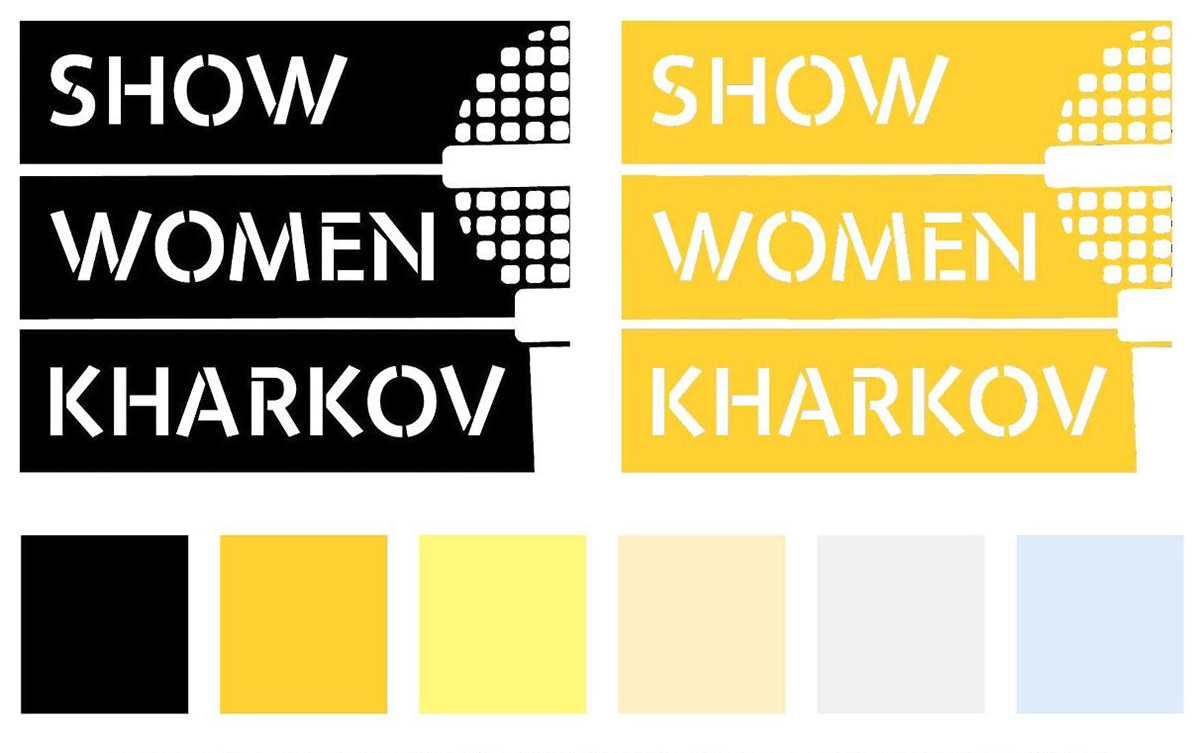
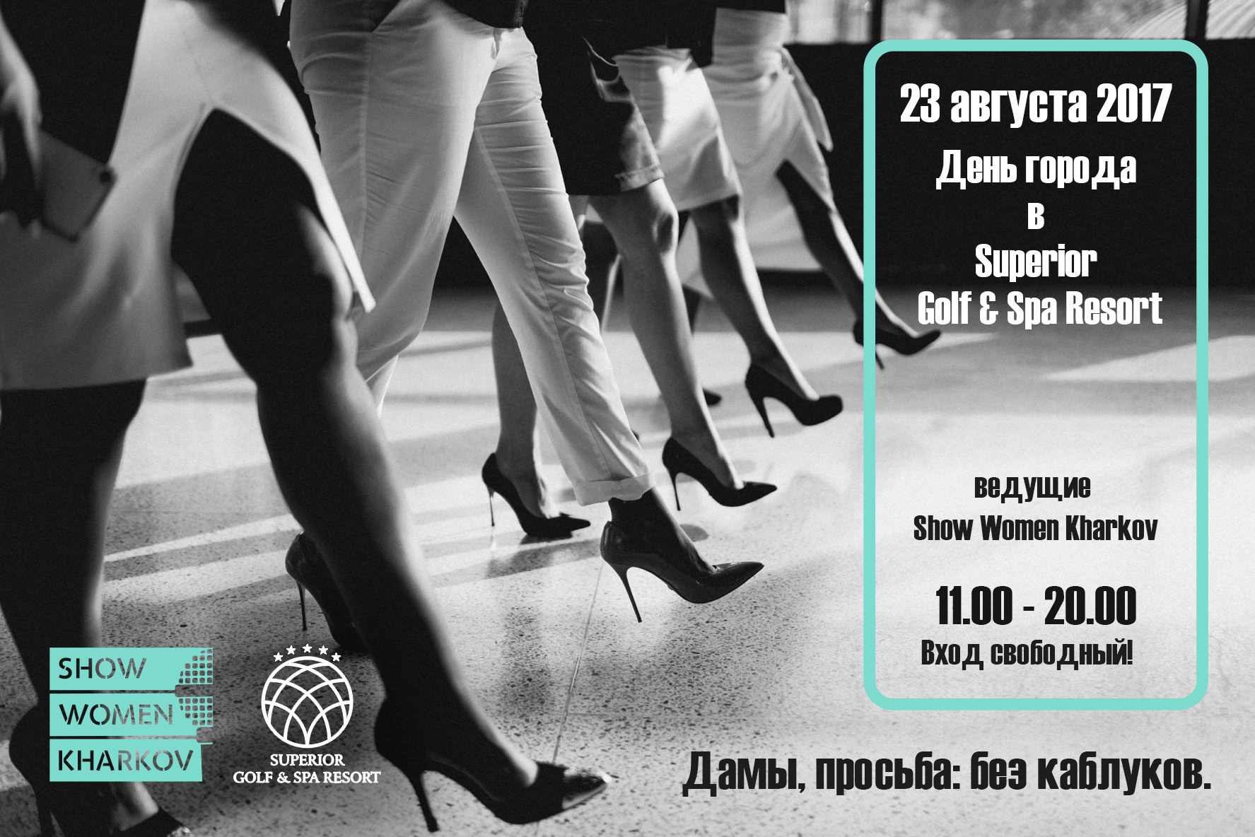
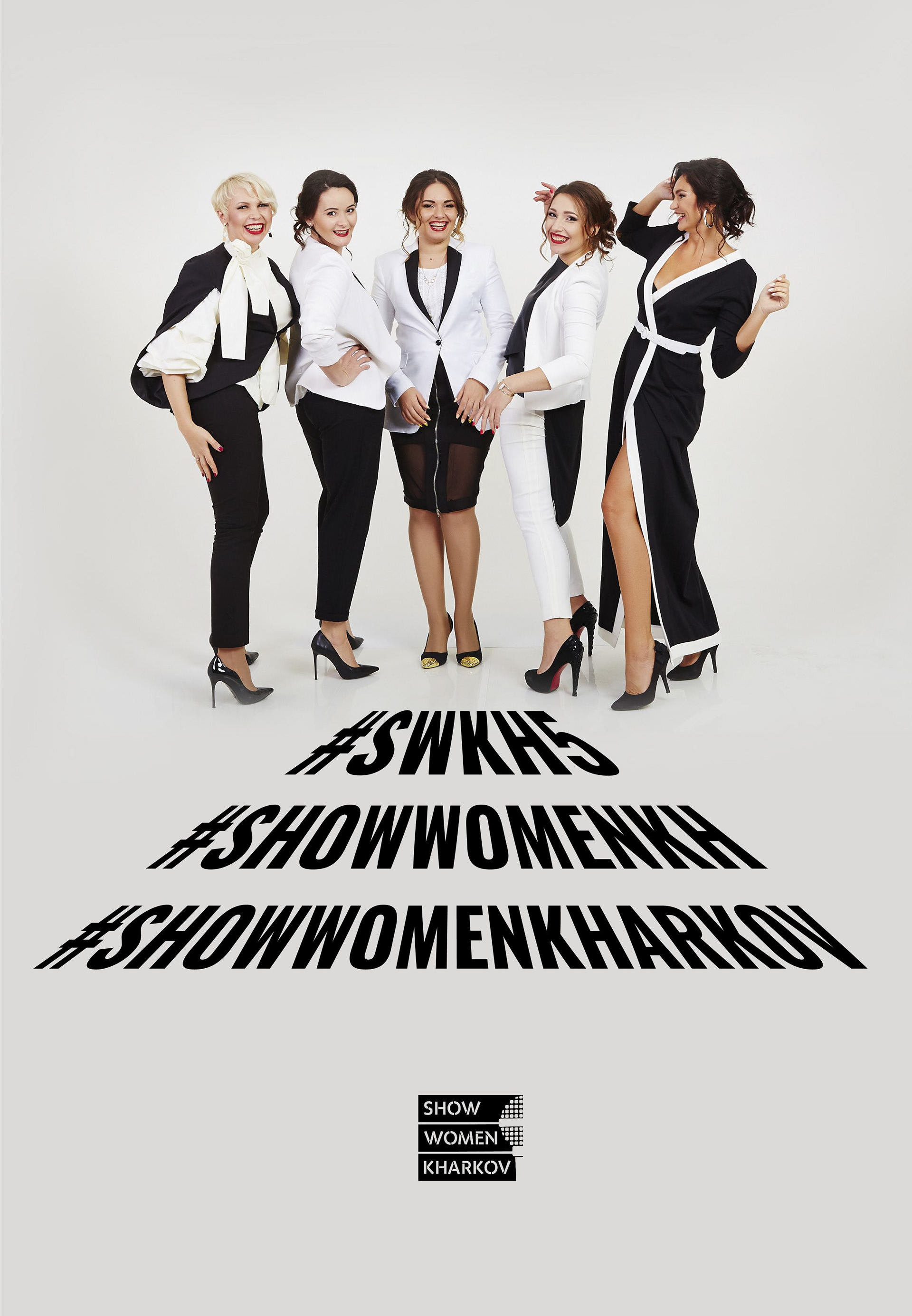
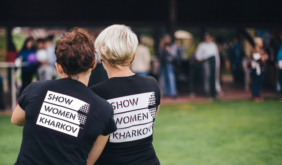
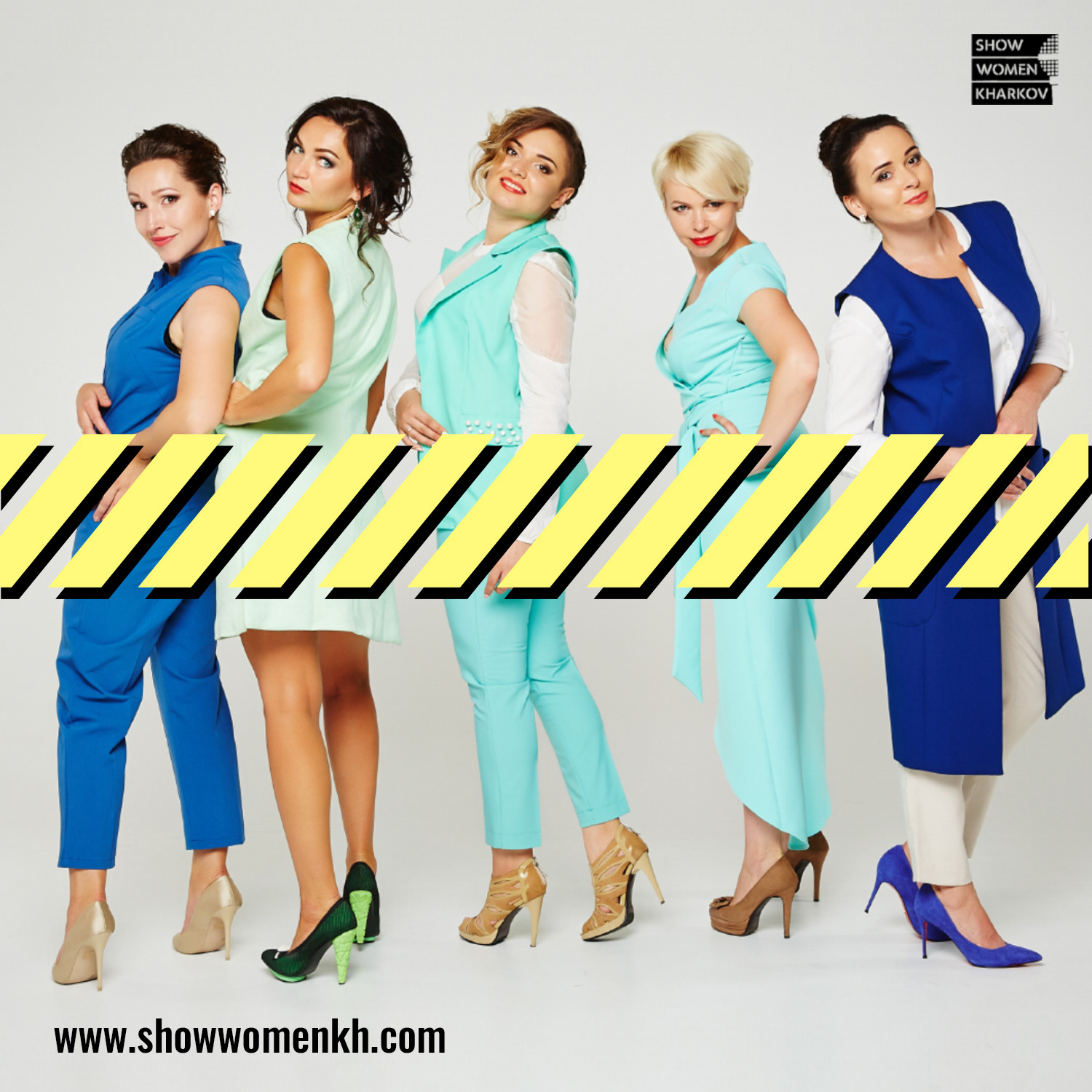
The logo was not supposed to have a feminine look, so strict letters and black blocks were chosen. All promotional products and the site has bright yellow black colors, but at the same time, are not devoid of femininity and a sence of celebration, as the girls work in the field of events.
My task was to develop a corporate identity, logo, templates for social networks, video clips, part of the design for the website, as well as promotional products including articles in magazines, etc.
The logo was not supposed to have a feminine look, so strict letters and black blocks were chosen. All promotional products and the site has bright yellow black colors, but at the same time, are not devoid of femininity and a sence of celebration, as the girls work in the field of events.